HOLY
DIVER
The Holy Diver is the darker brooding sibling of its kitschy older sister, The Early Bird restaurant located next door. With a decor inspired by teenage bedrooms (a pink neon sign hangs out front and the walls and bathrooms are littered with heavy metal icons, movie posters and Xerox art) this local cultural hub has some serious atmosphere. “The Diver” as it’s affectionately called, is more than just a community boozer. It gets the after party spillover when shows at other bars end, and this is when the space becomes the centre of the universe for all the punk rockers , b-boys, club-goers, goths, industry professionals, and assorted late night revellers, gay, straight or trans.
With a DIY ethos who’s primary focus is supporting the local creative scene, it is the kind of place where you can catch a band or singer when they are just starting out standing mere feet away from the performers. You may soon realize you might be the heart of a burgeoning community of early fans watching bands and DJ’s who are on the verge of …. “something.” The bar’s booking policy can be pretty adventurous from week to week with the tiny stage hosting a wide array of rock, pop, folk, jazz, and punk bands, and resident DJ’s who play metal, 80’s, hip-hop, and modern funk.
BRAND IDENTITY
GRAPHIC DESIGN
TYPOGRAPHYN


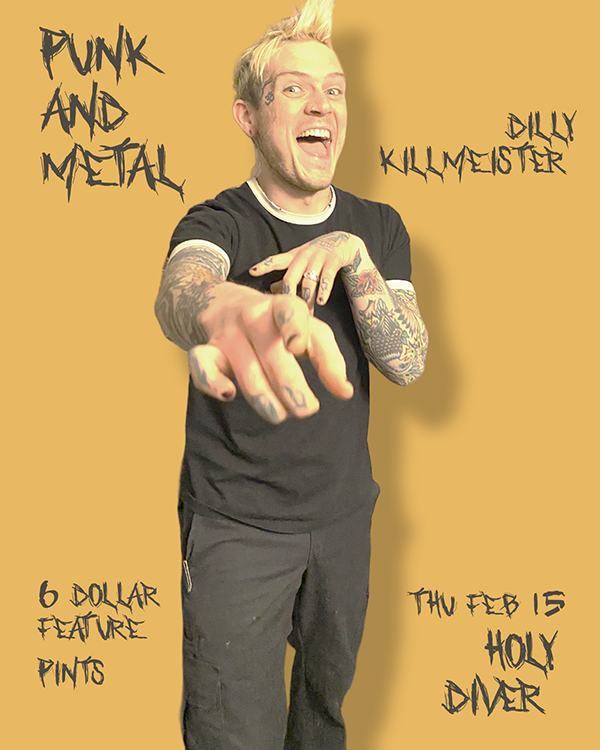
In the fall of 2023, I was hired to rebrand all social media assets for the Holy Diver in a way that would visually unify the bar’s varied, yet deeply interconnected activities. This project presented a unique set of challenges, as the bar had no unified style or look with the Holy Diver logo as the only recognizable indication about its identity. In many cases, bands and hosts submitted images of low quality, while fonts, images, and colour schemes seemed to be picked at random that had no relative themes or ideas.
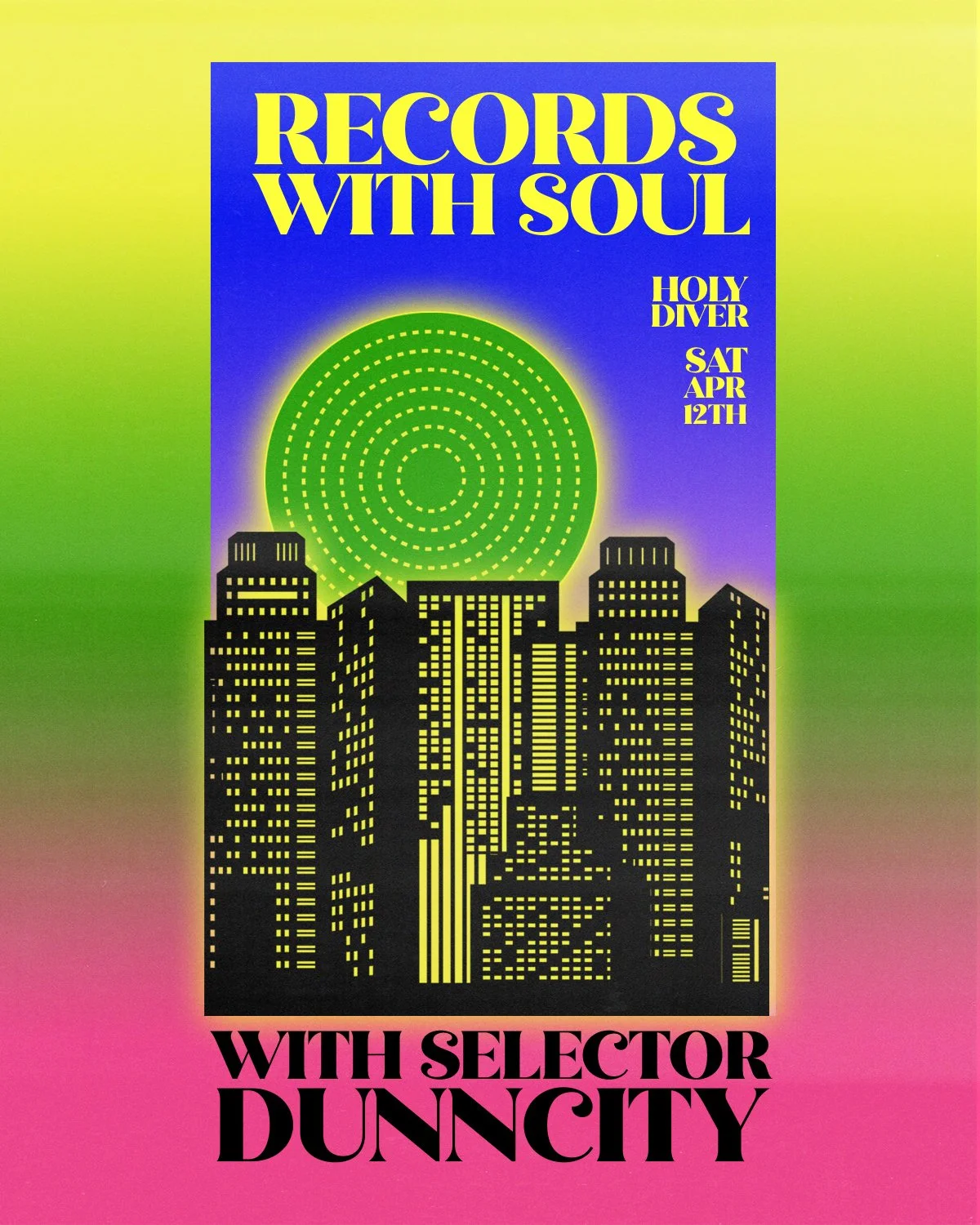
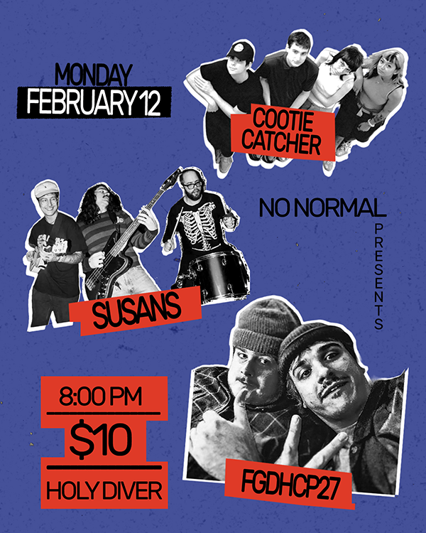
As was the case with BSMT 254, I presented a new social media branding outline. This time I drew inspiration from the sights and sounds of the late 1970’s and early 1980’s New York music and art scenes; a time when post punk, new wave, early rap, disco, glam, and graffiti street culture collided. Details from the bar interior, most notably the wheat-pasted 1990’s movie posters, rock, metal, and hip hop legends also influenced the visual identity. Photos of bands, event hosts, and DJ’s were added into the mix resulting in a style that unified the bar’s aesthetic with the same cut and paste techniques used on flyers and band posters from the aforementioned eras.
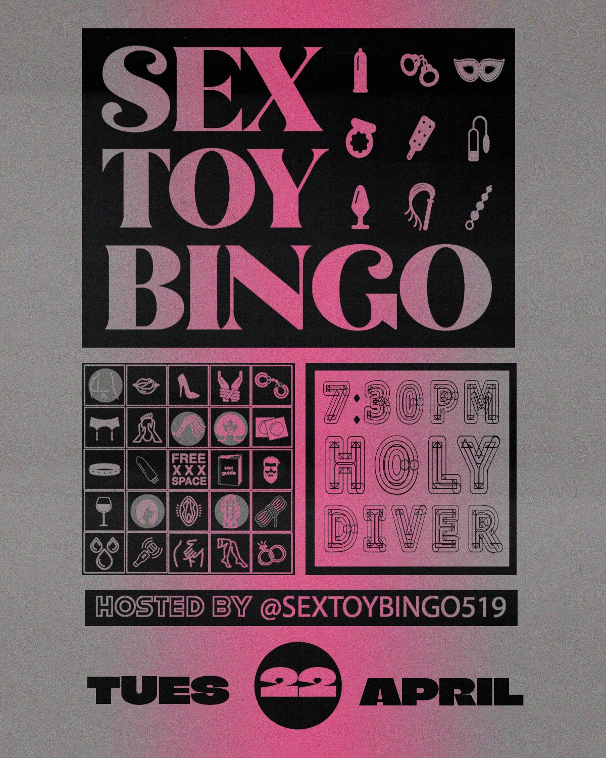
Unlike the bold and vivid aesthetic used for BSMT 254, I used a subdued colour palette seen on photocopied punk and hip hop flyers and posters. The images come to life with a messy mix of type and lettering and like the music itself, are often both complimentary and contradictory. This is contrasted by clean grids, random bursts of font sizes, and graphic shapes that appear in a mix of both rigid and loosely scattered arrangements. Similar to the designs for BSMT 254, the images of performers serve as the anchor point for the designs but rather than placing them centre stage, they are often placed in the back ground or pushed aside by bold fonts, putting the focus on relevant information.
This system works to accommodate a fast turn around time. The visual identity also has to be malleable as dates, bands, and times often change very quickly from week-to-week; and in any given month I can generate up to as many as 16-20 different posters for events. What started as a redesign for a few bands and DJ’s evolved into an entire visual overhaul for weekly calendars, food menus, and promotions for daily drink and food specials. Because there was no system in place when I began, the work for “The Diver” as its affectionately called, has allowed me to flex a wide range of design styles that strikes a balance between nostalgic and modern.


